React Native UI Components

Open Source Library Documentation

Get Started Quickly

Our React Native UI Components library provides ready-to-use, customizable components for mobile apps. Built with TypeScript and theming support, it helps developers create consistent and beautiful interfaces faster.

Installation

npm install @geekyhawks/react-native-ui-components
yarn add @geekyhawks/react-native-ui-components

For detailed setup instructions and theming examples, visit the full documentation.
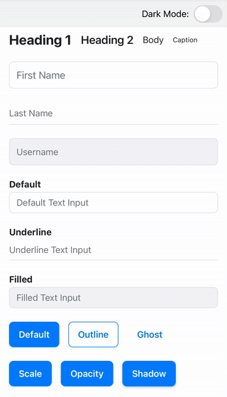
View Full Documentation on GitHub
UI Components Preview

Key Components

Theme

Global theming system including colors, typography, spacing, and light/dark mode.

Full Docs →

StatusBar

Theme-aware wrapper for the native status bar with predefined variants.

Full Docs →

AppBar

Customizable, theme-ready top app bar with left and right icons.

Full Docs →

Text

Customizable wrapper around React Native's Text component for consistent styling.

Full Docs →

TextInput

Styled input field with theme integration for consistent forms.

Full Docs →

FloatingLabelTextInput

TextInput with a floating label for enhanced form usability.

Full Docs →

Button

Enhanced button with default styles, theme support, and versatile usage.

Full Docs →

Radio

Themed radio button for single-choice selection, supporting groups and variants.

Full Docs →

CheckBox

Themed checkbox for multi-choice selection, supporting groups and variants.

Full Docs →

Switch

Themed toggle control with color variants and optional labeling.

Full Docs →

ActivityIndicator

Flexible loading spinner with text, size, and position options.

Full Docs →

LoaderModal

Full-screen modal loader with spinner, text, and theme variants.

Full Docs →

Want to contribute?

Fork the repository, open an issue, or submit a pull request. We welcome contributors of all experience levels.

Visit GitHub

Let’s Build the Future Together

Have an idea in mind? Let’s bring it to life with innovative, high-performance digital solutions.

Get in Touch