React Native UI Components

Build consistent, theme-aware React Native apps faster with our open-source library.

@geekyhawks/react-native-ui-components

A lightweight, theme-aware library of UI components for React Native, built with TypeScript. Provides out-of-the-box theming, customizable components, and cross-platform consistency—so you can build beautiful mobile apps faster.

npm install @geekyhawks/react-native-ui-components
ThemingTypeScriptAccessibleCross Platform
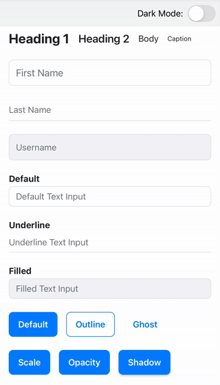
UI Components Preview

Components Overview

Theme

Global theming system including colors, typography, spacing, and light/dark mode.

View Docs →

StatusBar

Theme-aware wrapper for the native status bar with predefined variants.

View Docs →

AppBar

Customizable, theme-ready top app bar with left and right icons.

View Docs →

Text

Customizable wrapper around React Native's Text component for consistent styling.

View Docs →

TextInput

Styled input field with theme integration for consistent forms.

View Docs →

FloatingLabelTextInput

TextInput with a floating label for enhanced form usability.

View Docs →

Button

Enhanced button with default styles, theme support, and versatile usage.

View Docs →

Radio

Themed radio button for single-choice selection, supporting groups and variants.

View Docs →

CheckBox

Themed checkbox for multi-choice selection, supporting groups and variants.

View Docs →

Switch

Themed toggle control with color variants and optional labeling.

View Docs →

ActivityIndicator

Flexible loading spinner with text, size, and position options.

View Docs →

LoaderModal

Full-screen modal loader with spinner, text, and theme variants.

View Docs →

Want to contribute?

Fork the repository, open an issue, or submit a pull request. We welcome contributors of all experience levels.

Let’s Build the Future Together

Have an idea in mind? Let’s bring it to life with innovative, high-performance digital solutions.

Get in Touch